The Challenge
The goal of this project was to create a unified visual identity that represented the consortium’s educational mission while remaining adaptable across both digital and print applications. The identity needed to feel modern, recognizable, and culturally grounded.
Case Study
As the graphic designer, I was responsible for the full visual identity including the logo, business cards, and promotional pin concepts. I was given full lead with creative direction and presenting the concepts through the final design before moving forward with promotional designs.
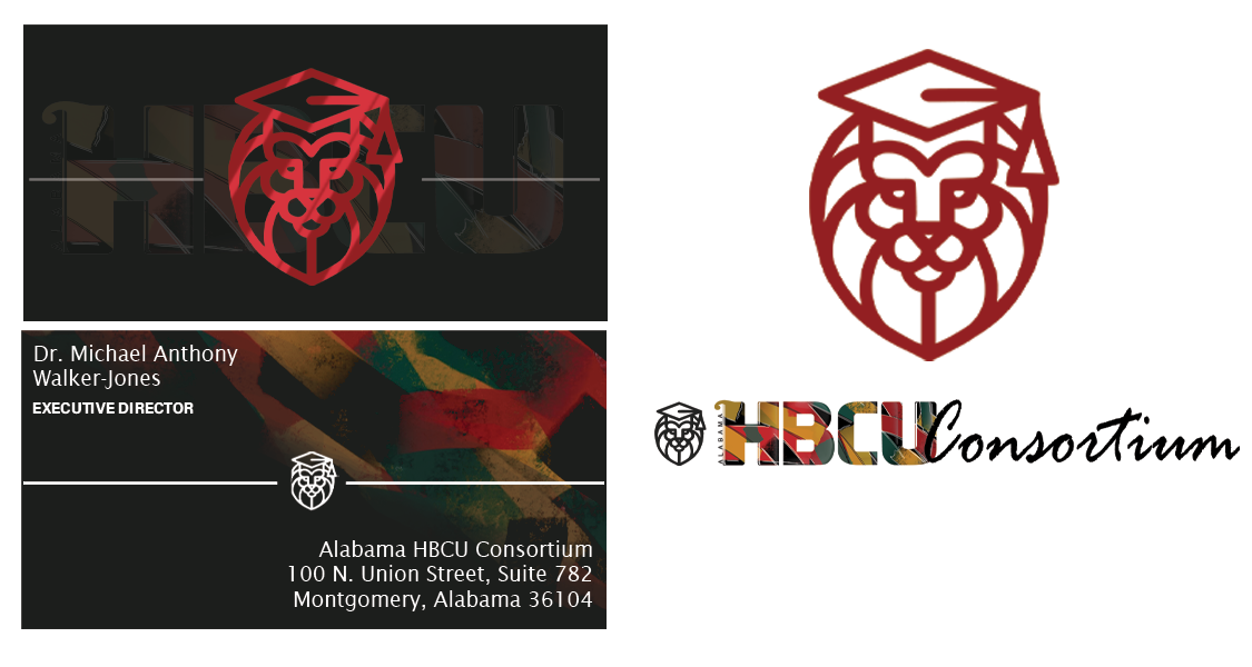
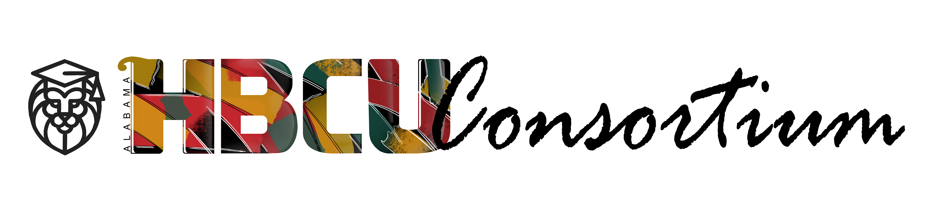
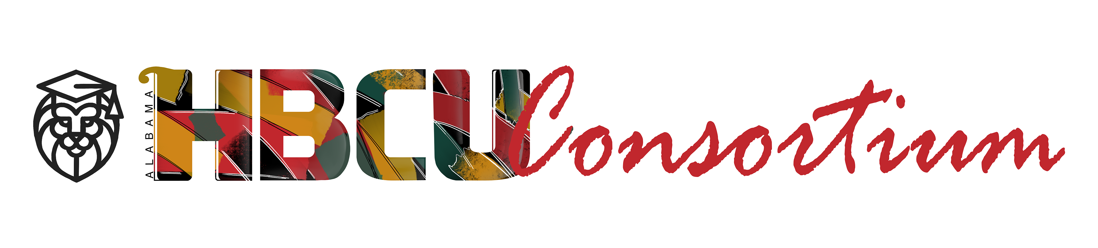
Logo Development
The logo design process began with hand-drawn concept sketches focused on creating a mark that felt professional and adaptable across both digital and print designs. Many concepts were explored until refining the final direction into an identity that balanced the modern collegiate feel. The hand-painted texture was still implemented using black, yellow, green, and red inspired by Pan-African colors. This choice was to avoid a static, stoic image and more living, expressive, and connected to its cultural meaning, while also molding a graffiti-like pattern.
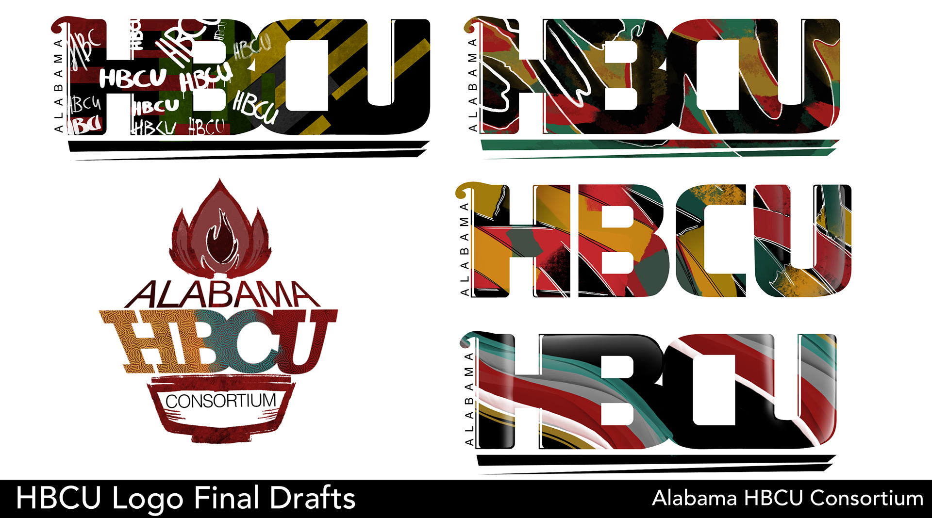
The finalized logo was created to maintain versatility in order to keep readability, a clean structure, and a professional identity.


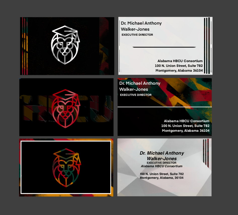
Rough Business Card Concepts